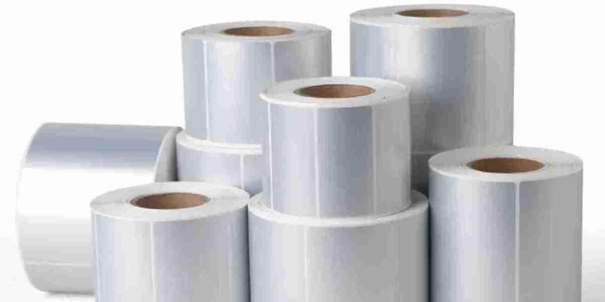

Matte labels live for colour, and brands often turn to it to grab attention or help them convey their brand personality. Matte surfaces absorb light, so the colours appear softer, more subtle and muted. The resulting appearance can make a label look natural and earthy and therefore appealing on the store shelf. Picking the right colours for your matte labels is an opportunity to make them a visual messaging power tool and have your labels communicate something meaningful about your brand without having to say a word. The secret to achieving packaging that looks ‘just right’ and approachable for every customer lies in understanding colour relationships on a non-shiny surface.
Warm Colours
Deep reds, fiery oranges, and sun-kissed yellows are warm hues that give off a cozy, inviting vibe on a printed matte labels surface. The vibrant tones catch the eye with aplomb, without being too jarring, when set against neutral container surfaces. Warm colours make food products and handmade items look appetizing and comforting. Ideal for brands that pride themselves on their artisanal appeal, the non-glossy finish means that even the boldest crimson or sunshine yellow looks sophisticated and well-thought-out to the viewer.
Cool Tones
Cool colours like gentle blues and pastel greens exude a sense of calm and trustworthiness on matte cosmetic and wellness packaging. They convey cleanliness and purity and natural ingredients that tap right into the aspirations of the customers who buy wholesome products to build healthy daily routines. Cool colours work really well with matte paper, as they never lose their depth, creating a soothing and serene visual effect. Using these pigments is the ideal way to make your customers believe that your brand is always there for them and that they can rely on it completely. Minimalist fonts only amplify this effect.
Neutral Tones
Neutral tones like sand-coloured beige and stormy grey offer a classic and timeless appearance that allows your product to take centre stage. Perfect for artisanal goods and organic skincare products, these understated colours communicate authenticity, which is a key driver of sales in these product categories. A neutral background also means that your brand’s logo remains front and centre without any competition or visual noise getting in the way. In addition, the understated palette says to the consumer: “We’re honest and down-to-earth, and we’re proud of it!” while maintaining a clean professional sheen that can only earn long-term customer loyalty.
High Contrast
Dark black against stark white is a combination that can never go wrong. This timeless colour palette results in extreme legibility, which means that the vital information about the product will be available to the customer at a glance, without any confusion. The high contrast works wonderfully with matte paper, with the added advantage that the lack of glare means your customer can browse the essential product details from any angle in the store without having to squint. In fact, if simplicity is what you’re going for, then you can’t really go wrong with high contrast.
Bold Colour Accents
Adding one bright colour like turquoise or yellow to a minimalist or neutral design is a great way to create a little focus on your product. This added pop of colour will also attract the consumer’s attention to key product features naturally and effortlessly across the container’s surface during the browsing stage. On matte surfaces, using colour judiciously can prevent packaging from looking tacky and overcrowded, while simultaneously adding a playful spark of surprise. The result is a fine line between corporate and creative that can attract eyeballs and compel browsing.
Earthy Hues
Earthy greens and clay reds evoke the senses and draw a direct line to the great outdoors, which is why they are the perfect fit for environmentally friendly, sustainable, and earthy brands. These are organic hues that blend in effortlessly with the recycled cardboard and glass packaging containers used by responsible manufacturers all over the world. They immediately signal eco-conscious production to the consumer and communicate a shared commitment to protecting the planet. In addition, the soft matte surface finish only adds to the organic effect, making the entire package a delight to hold and see in daily life.
Pastel Tones
Soft lilac and baby pink are just some of the pastel colours that will add a touch of delicate charm to your specialty or gift items. These understated hues look friendly and approachable and never come across as harsh or tacky, custom stickers no minimum no matter the retail environment. Pastel colours work particularly well for handcrafted and boutique items where connecting with the customer’s emotions is what can sway the purchasing decision in your brand’s favour. The velvety surface of a matte sticker also prevents the pastel shades from washing out or looking brighter than they are in store lighting.
Conclusion
Matte labels offer a non-shiny canvas for your selected colours to shine without creating visual noise or glare. Whether you love warmer, earthier tones or you prefer crisp high-contrast combinations, there is a palette that will help your brand to elevate packaging and connect with your audience. Paying attention to the shade selection for your labels will go a long way to ensuring that your brand is sending out messages of quality and intention in every single item that you put out into the market. With the help of some tasteful colour choices and a touch of tactile difference, you can create a lasting impression on your customers that will keep them coming back for more and more.